Redesigned interfaces, new features and artificial intelligence are meant to enhance the experience, even if the changes can be confusing at first.
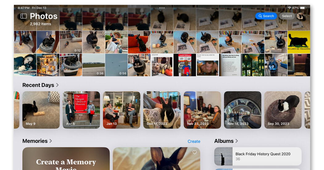
Apple’s fall overhaul of its Photos app — publicized by the company as its “biggest redesign ever” — gave the software a fresh look and new methods for managing your portable picture library on the iPhone and iPad. However, not everyone was a fan, as the new design retired familiar navigational icons in favor of a “unified” view that put almost everything on one screen.
But thanks to inconspicuous menus and settings, you can arrange things more to your liking. Here’s how to find your stuff in the latest version of Photos, along with a quick look at some recent changes to the Google Photos app.
Take a Scroll
Apple’s iOS 18.2 update last week fixed a few issues that users had been complaining about since the new Photos app landed in September (like videos automatically looping). But the app’s overall design is the same: You start off on one big screen for your picture library, albums, videos, selfies and everything else.
The exact items you see depend on your device, as many late-model iPhones and iPads have the new Apple Intelligence software for making things like “memory movies” on command.
How you find things depends on which way you scroll:
-
Looking for your photo library? Swipe down to roll through the grid of image thumbnails, which goes farther back in time the more you scroll.
-
Looking for albums, videos, favorites, the duplicates menu and other tools? Swipe in an upward motion to scroll toward the bottom of the app and through the automatically generated groupings (like Recent Days or People & Pets) and your handcrafted photo albums. The menus for Media Types and Utilities are here, too.
-
Looking for a certain image? Tap the blue Search button at the top of the screen to start hunting specific photos or videos.
Change Your View
Both the photo library and the collections-and-menus areas are packed, but you can streamline what you see.
